Choosing pagination tap zones
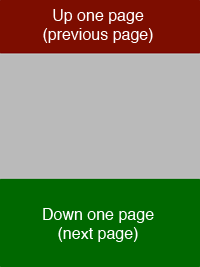
Instapaper Pro 2.2’s tap zones for pagination:
I debated about these for a while and tried a few others during development:


Sides only: Didn’t fit with concept of web pages, especially since you can toggle out of pagination mode and scroll manually at any time. The content is still mentally modeled as a vertical column, so top/bottom is inherently more intuitive.
Hybrid modes: Caused unpredictable behavior near the shared corners.
After much deliberation and testing, a simple top-and-bottom arrangement made the most sense. Note that the bottom zone is larger than the top zone, since “next page” is a much more common action than “previous page”.
I found that the gray “dead zone” is required, rather than making the zones cover the entire screen. Paging should be deliberate, never accidental, and it should never advance in the opposite direction than expected. By only making the exterior edges trigger pagination, customers learn to avoid the center area, which removes most chances for ambiguity and incorrect directions. This lets them maintain control, which keeps them happier and more focused on what they’re reading.