im considering this smaller title font size for
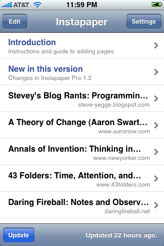
I’m considering this smaller title-font size for the list screen. It fits more characters from the title, so you can more easily distinguish articles with similarly-starting titles.
The regular size is 20px bold. This is 16px bold. I can save a few characters by making it normal-weight instead of bold, but it looks a little strange.
What do you think? Too small? Just right?